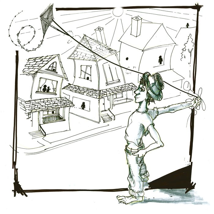
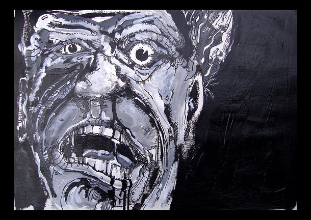
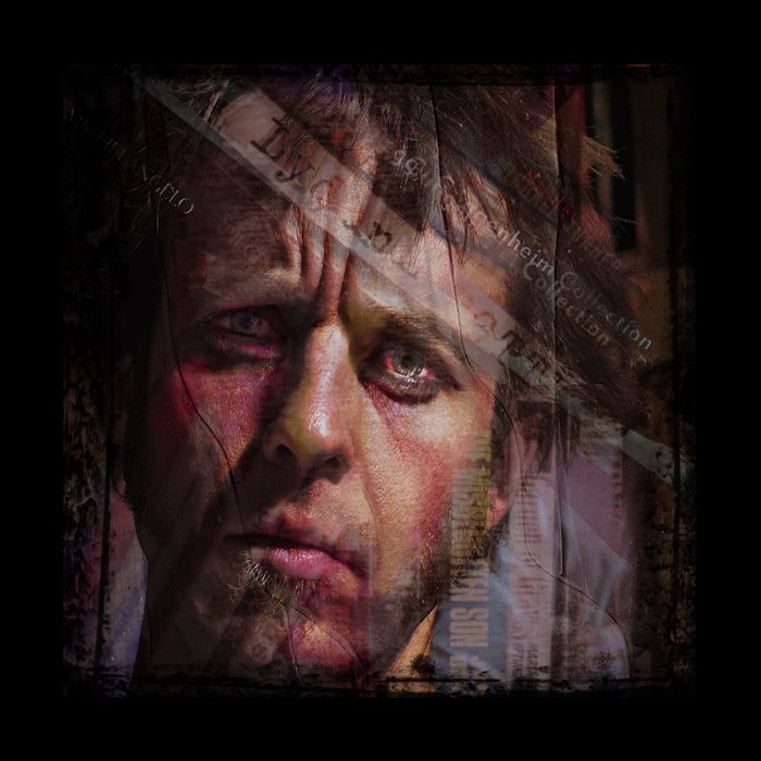
I made this image a couple years ago when school and project deadlines were starting to get to me, It seemed appropriate to post it here again at this time. I have a few more with a similar flavour. I will post them unless I can create something new. Cheers
Author: thehoffmanian
If You Like to Draw
I found this link on deviantart, it was a tonne of fun, could be because I was over tired or that I miss skiing. Check it out and draw.
Design – Illustration – Dead Birds _ Bad Font
A long time ago I was asked to design a collection of stamps with birds as a theme, by the end of the project I was getting a bit tired of birds – the little feathered friends ended up as dead feathered friends – the collection looked something like this, it was good fun and was one of my first attempts at using illustrator….I am getting better with age….slowly
Design – Simple Design
I am sharing a cover design before its fully completed, feedback is welcome. I am posting it mainly to share my new favorite font. This is Prensa, an instructor at ECIAD introduced me. I have read up on Prensa and the designer Cyrus Highsmith; it is a font that is believed to stand the test of time. It’s not a nose in the air type font but has the presence to get the same job done. MensHealth, Martha Stewart Living, and newspapers from El Universal in Mexico to La Prensa Gráfica in El Salvador have used it and Prensa won the citation of excellence from the international type competition, Bukva:Raz!. Anyways in an effort to get to know some fonts-well I have been looking to get to know Prensa.
Design and IIlustration – Erick Arthur Blair


A project I have been working on—keeping in tune with my interest in illustration, is a story that tells the reader a bit or a lot about George Orwell epending on the readers knowledge of Blair prior. It tells of his love of writing, his political passions and fears, it touches on his personal life and is filled with imagery from 1984 and Animal Farm. It has been a challenging and educational. I will eventually post a few spreads but I am looking at the typographical elements being worked out further before I show you more……here are few illustrations the are worked into the so called kids book for an older audience. Let me know what you think.
Illustration – Simple Truth


I have posted a couple small drawings, these or just a sample of a pile of drawing that I have made over the last year in an attempt to map time. Time that specifically relates to commuting by bicycle in the city of Vancouver whether it happens to be to the store for bread and milk or a longer ride to school or work. I have used a simple outline of bike forms to replace text and in a sense replace a written truth, the truth of time to be more exact…., I will post another ever now and again just to enlighten the blog with a truth…..a simple truth. Each drawing is timed to be the exact amount of time equivalent to the commute time, hence the map of the commute….interesting….maybe?
Illustration – Wasted Paint
Illustration – Synthesis
Illusration – Free Geek Revised
After a few alterations to the character expression—to fit the story line better, I have here the final illustration for the magazine. Anyone heading to Vegas for the big bike show will be able to see it first and then it should be all ove BC by the start of October. I am as always interested to see what the designer does with the drawing. I guess it will be a surprise. Keep in touch and let me know what you think.
Illustration – The Jims I KNOW
This is an intersting drawing from an old sketch book, I will try to get a bigger image for you all, but its influenced by Jim Dine, a famous maker of lines and stuff. I have met some amazing Jim’s in my life – one in the music circle, another in the world of art, and another in the bike world, these guys all live and breath life with passion, everyone should follow suit.


