What an amazing journey – as an illustrator, as a graphic designer and as a cyclist – the dream project for that person would look something like this – A new line of bikes that needs graphics, illustrations, and the artistic touch of a bicycle enthusiast. Terry Walker from Mountain Equipment Co-Op (MEC) had been talking to me for a while about bikes; after all it wasn’t that long ago that we worked on Know Your Bike – a project for aiding the service department at MEC stores while talking to members about their own bikes.
The bike project started in a board room 2 years ago and there were MEC executives on both sides of the fence. Bottom line out of that meeting was that Canada’s own Mountain Equipment Co-op was going into the bike biz and I was going to be a part of it – I worked on the project for the last 4 – 6 months. My day job as a Graphic Artist at SUGOI Performance Apparel meant I was going to be sleep deprived – That was fine. The goal of course was also to be able to get my rides on the North Shore in regularly – Jeff Bryson -Thanks for helping with that.
Terry Walker was going to be my main contact for the entire project – Terry shares a passion for 2 wheels and has a good eye for design. We got along great and had a very similar vision – That helped keep the path smooth. I would also cross paths with Judy Snaydon – the Art Director at MEC and Tim McDermott the Product manager for the entire project – These bikes truly are Tim’s baby.
The first meeting was with the entire group and I left there a little light headed, holding a pile of notes and of course few things that Terry brought for me to base my process spring board on.
They knew that they wanted it illustrated and they knew my style so it was a great way to start the project off. I left with more ideas than I knew what to do with. I would get to my studio and start the same way I start every project – Sketchbook on one side, world wide web on the other. Ink flew from the pen, it flew from the printer – some of it on paper, and some of it on the floor – it was an exciting time. Some inspiration came from the bike community – Old and New.

And some inspiration came other artists and existing projects.

I wanted the illustration to tell a story, I can hear Terry chuckling as I type this out – I was determined to keep a story going with in the bike graphics. On top of that I can hear Terry talking about a where’s Waldo kind of feel. I think we were successful on both accounts.
Every good story needs some characters
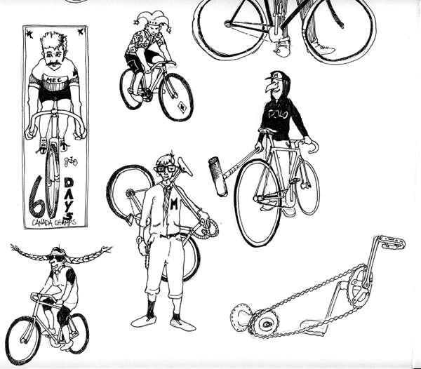
Every good story needs a hero.
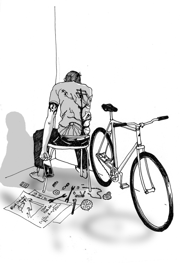
I also felt it would be great to bridge the urban feel that the bikes would find themselves in and the natural feel that MEC has built its reputation on – there is a bunch of this going on in the graphics and I enjoyed building these highbrid riders and these nature/urban elements.

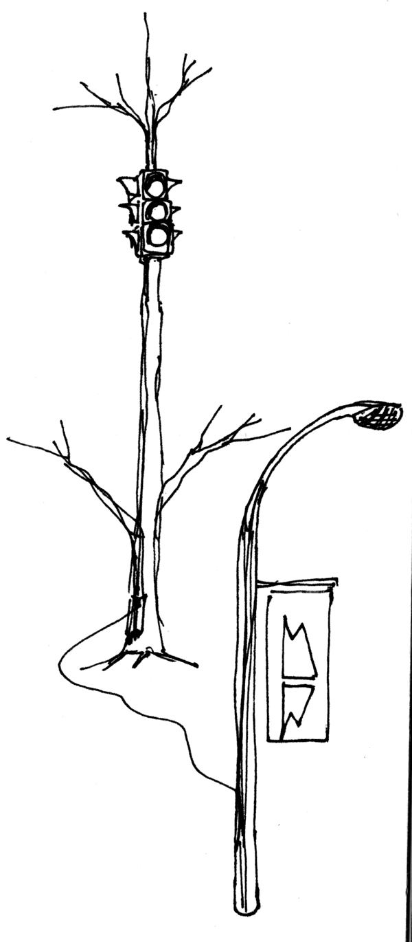 As I created more and more characters some made their way into the garbage and some others that almost missed the cut – but I insisted there was a place for them in their slightly off kilter politically correctness – made it to the show – I saw that as important – maybe even essential.
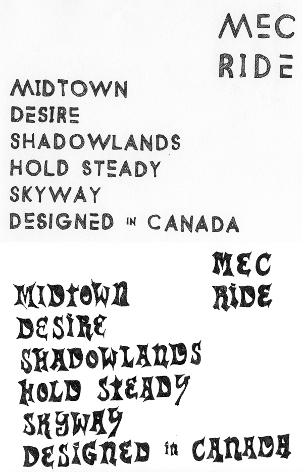
We looked at illustrating type – don’t you just love type – I made 2 to choose from.
I tired to present my idea’s to the folks at MEC as regularly as possible. Some of the presentation pieces are here – this open line of communication kept the project running smooth.
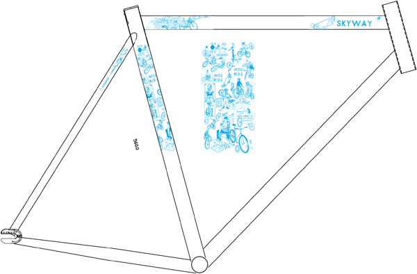

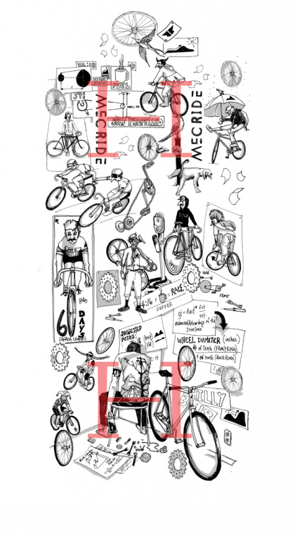
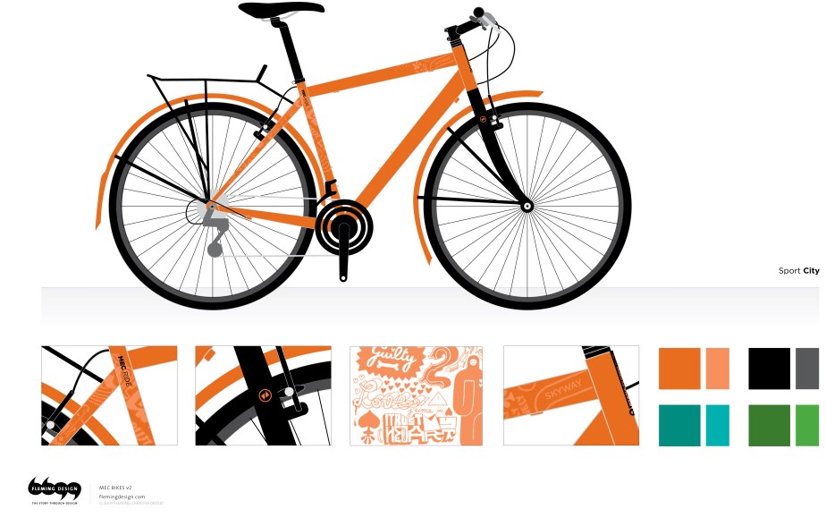
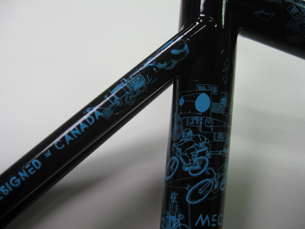
Working on flat surface was the easy part, but to really get a feel for how the illustrative story was going to unfold I convinced Terry and Tim to let me take a frame home – a top secret prototype to be exact – here are a few shots of how cutting and pasting skills learned in art school really pay of. Whom ever said form wasn’t fun never had the chance to work on bike frames.


Matt Warburton (Emdoubleyu Design) if you are ever reading this – you mentioned this process to me a few years ago when we had a talk about some of the work you did for Rocky Mountain – Thanks for that.
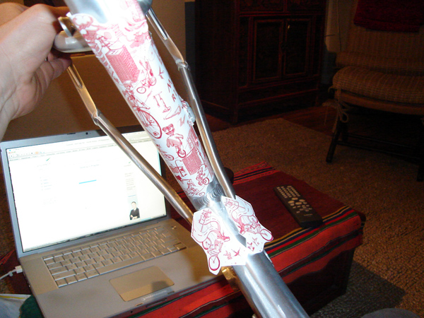
There was numerous conversations about keeping it just simple line work or jazzing things up by adding tone – tone won the battle and I am not sure if we would go that route again. Some of that organic sense that the illustrations had – perhaps was lost in the process of making the actual decals. The guys in Taiwan that were printing and applying the decals had a couple applications that the illustrations went through and it didn’t seem to be as smooth as I felt it should have been – but that of course is part of the learning process and I learned a tonne. Time lines and budget had us make the call – Terry was under pressure at this point – it was time to get the proverbial ball rolling on some samples.

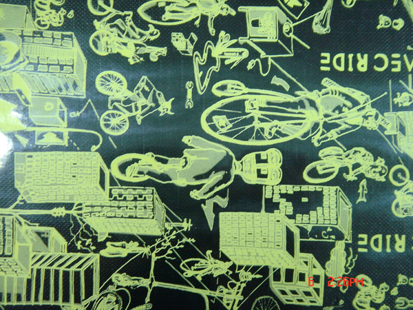
Once we started seeing samples like this – the illustrations were entering final edit’s, there was debates about adding French elements, some of the type treatments were changed but really I feel the project from my end was pedaling rather smooth – spinning you could say – I am sure Terry and Tim were under much more pressure.
As the main graphics were starting to be finalized there was still work to do on the top tube names, and the smaller graphics that would give each bike its own unique identity. both of these found their way to the cutting room floor – there was many that followed until Terry and I were on the same page – more images to follow on that.


It was around this time that Taiwan was starting to send us some real life bike pictures – keep in mind we were still making changes that would eventually be on the bikes you will see in the stores. These shots look like they were taken in the lunch room – maybe.

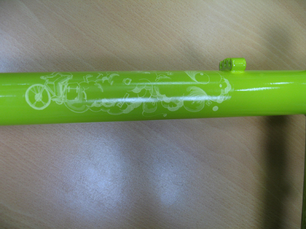

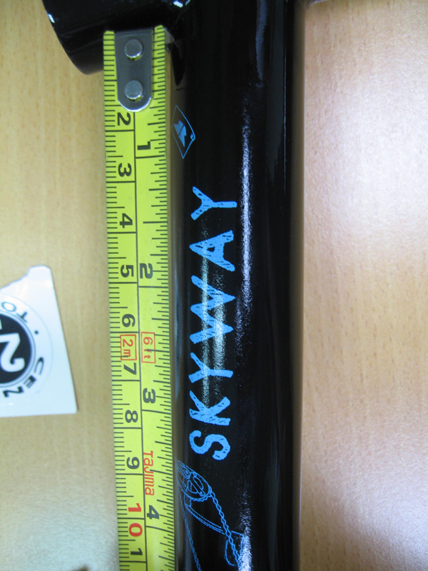


That last one is one of my favorite process shots with the water decals waiting to be applied in the background.
The following is an internal news flash regarding the bikes and Thanking Tim and Terry for their sweat that was shed during this whole process.

With in a week or maybe three – it seemed like years really until the first couple prototypes would arrive in Vancouver. Staff at head office in Vancouver had been riding these bike without decals for most of the summer and it was clear to the public that MEC was getting bikes. For Tim is was great to hear what his coworkers thought as they tried out the bikes and some minor changes came about because of some of these water cooler bike chats and critiques. Everything from appearance to bike handling was open for discussion. For me the icing on the cake was when the first fully illustrated bikes were assembled and hit the street.
Here is my favorite – the fixie- but really they all look and ride great. I will have some great shots of the entire line coming shortly. These bike are on the floor in Quebec – and they are being built right now here in Van to be in the Store on Broadway – Saturday.

This image was from August maybe – give or take – but it wasn’t until MEC launched the bikes Wednesday at a private party here in Van that I was able to share my excitement with you.
These bikes look awesome, was surprised to see them in the Calgary store a coule days ago.
Very cool. I have always loved RVCA, and to see the art translated on to MEC’s bikes is great! Great choice!
My oh my!
I knew they were having the bikes built but I wasn’t aware the bikes were going to have “designs” on them!
I’m super excited to get home and purchase one of these. I’ll be sure to think of this when I finally get to look these beauties over.
Thanks so much!
– Mya
Awesome story of graphics for cycles. Any chance of finding some art graphics to add to a frame being shipped to me now?
I want some pink or pink on white art for my grand daughter.