Find out your professional archetype at StopTheGuessing.ca.
Author: thehoffmanian
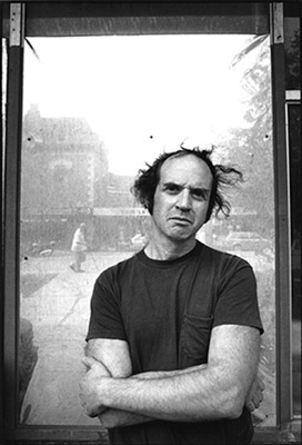
We miss you Harvey – Harvey Pekar (1939-2010)
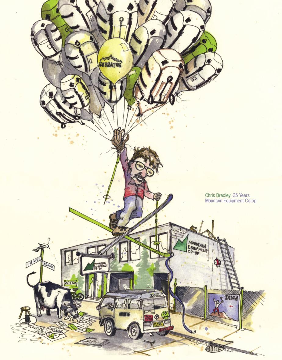
Retirement Poster – Chris Bradley – MEC
Bowen Island Designer with an Ego or is she simply an Artist ?
If you ever have a chance to see Marian Bantjies speak you must, and if you have a chance to see here work you should. Marian was a regular guest of the Communication program at Emily Carr and I took every opportunity possible to hear her speak. She played a major role in Canada’s GDC ( Graphic Design Association) and is continuing to change the landscape of Graphic communication. Ego – no doubt, justified – you decide.
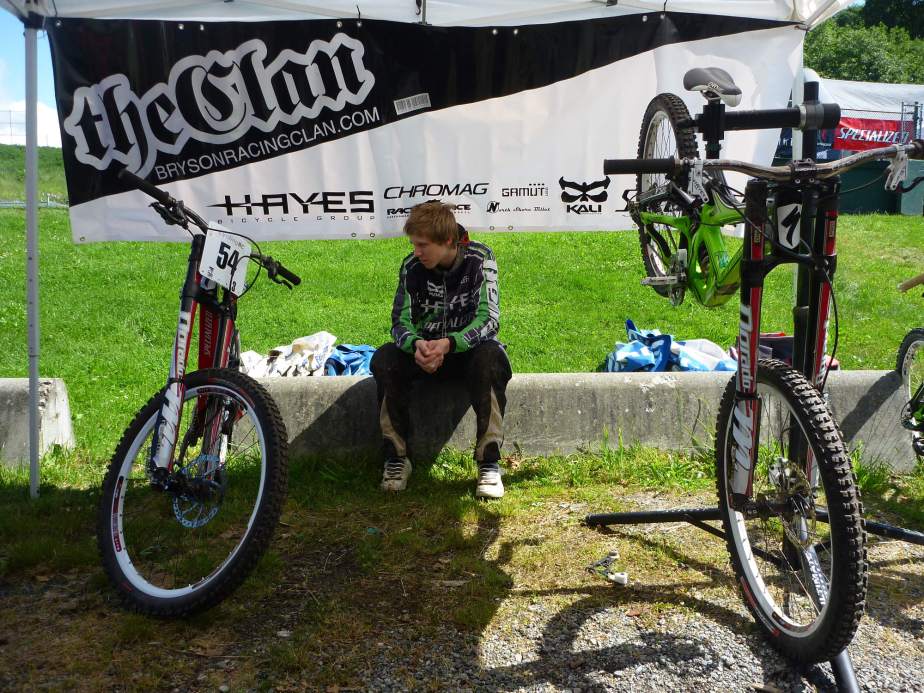
Racing Clan Graphics – Design
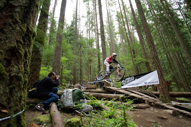
Continuing to combine my interests in design and bikes has allowed me to really embrace my work with Jeff Bryson and his Racing Clan – Here is a banner show-casing the Neds Ga___p Jump. More decals are coming soon for the team and the Clan will be Nation wide. I will also have a post soon about “Tuned by Buckwheat” identity project – stay tuned.
Photo and Illustration Awards issue is out
Check out the Applied Arts site – Cheers
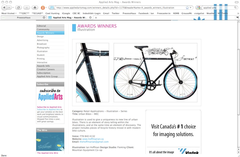
WINNER – Illustration
SUGOI/Cannondale Photo shoot
It has been awhile since the shoot but seeing Dan Barham’s post of this image always makes my day. Also check out Dan’s words on his Blog.
Confessions of hipster
I had to post this – brings me back to my days at Emily Carr and the Studio in China Town – Happy Surly Unlucky.
GRAPHEX 2010 Award WINNER
I need to Thank Matt and all the people who made Graphex 2010 possible – here are Matts Kind words about the MEC Urban Line.
Co-Principal Emdoubleyu Design, Vancouver, BC // emdoubleyu.com
This was a tough decision, but I gravitated towards
this project for a number of reasons.
One, I’m a cyclist.
Two, I’ve done bike design and bike graphics and
I think the designers on this project came up with
a branding solution for these new bikes for MEC in
a really unique, innovative but totally appropriate
manner. They are urban bikes, they are supposed
to be stealth—you don’t want loud splashy graphics—
and I like the fact that these guys don’t have
to compete against other bikes in the store so they
were able to go quite understated in the design. With this design you would have
no problem worrying about locking these bikes on the street because they don’t
look that fancy from the distance, but when you have a chance to get closer and
see the graphics details come together, it is like a very intricate and subtle tattoo
that not many people get to see up close, and you keep discovering new things
on it every time.
And three, they are lots of fun…I’m jealous!
I can not say enough how great it was to work with Terry, Tim, and Judy at MEC on this project and of course credit is do for all the Creative minds at Fleming – who entered this at GRAPHEX 2010 – Design Currency in Vancouver. All the Awards can be seen here – http://graphex.gdc.net/winners/winners.html

