The National

Working with Mountain Equipment Co-op is always a bonus, the projects are well organized and more often then not represent an active healthy way of life in Canada and around the globe. This project was to design the graphics that would do just that – take you across Canada and ultimately around the globe on 2 wheels

The MEC National.

In predictable fashion, this bike was always out on a tour when I want to take it for a ride or to shoot it for my records. Hard to complain about that really. 

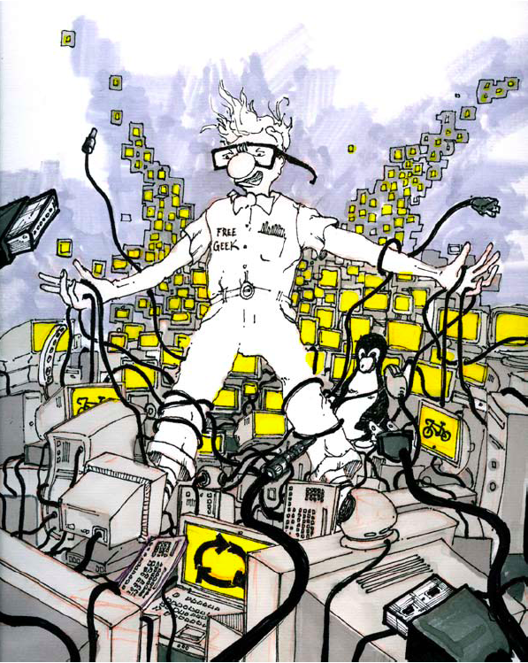
Those that follow my illustration and design process know that I am about a character and a story, the rest of course tends to follow when you get those in place.

First a look at a couple main characters.

ImageImage

They are gentlemen (sorry ladies, the bike only comes in a mens frame option) and they are ready for touring, one guy even has a TV on board and his pet fish – this guy ended up on the cutting room floor. I am sure we will see him again somewhere else.

Next I created a sign for each province and territory – it is a National after all.

ImageImage


The signs set the stage for the Tour, and essentially are the plot for the story. Here is the main graphic.

Image 

The side illustrations on the frame are where your main character is in motion and a flowing signs add movement to the adventure. The story of touring is all about places, roads, road maps, and sign posts. If it’s the organized straight lines of the main drawing or the intertwined speed of the side view – its about the journey.

Image

ImageImage

Image


Obsessionbikes.com – Illustrated

Great opportunity to work with Matt Warburton at Emdoubleyu Design – this time illustration for a bike store in North Vancouver – Aptly named and branded Obsession – because of course they are obsessed about bikes.

Here is a few sketches working towards the above illustration – there are a few more on the Obsession site as you click through all the great things that make Obsession so obsessed.

This first image was a quick sketch to show Matt what I was thinking and what google said bike fit was – it was not what he was thinking:

This second one is after a visit to the store to see the tools used for bike fit:

I was on the right track – but it clearly needed a person or 2.

This was the best part – the characters were “too” accurate and I was not doing what I do best – illustrate – this was close to a finished drawing.

GRAPHEX 2010 Award WINNER

I need to Thank Matt and all the people who made Graphex 2010 possible – here are Matts Kind words about the MEC Urban Line.

Co-Principal Emdoubleyu Design, Vancouver, BC // emdoubleyu.com
This was a tough decision, but I gravitated towards
this project for a number of reasons.
One, I’m a cyclist.
Two, I’ve done bike design and bike graphics and
I think the designers on this project came up with
a branding solution for these new bikes for MEC in
a really unique, innovative but totally appropriate
manner. They are urban bikes, they are supposed
to be stealth—you don’t want loud splashy graphics—
and I like the fact that these guys don’t have
to compete against other bikes in the store so they
were able to go quite understated in the design. With this design you would have
no problem worrying about locking these bikes on the street because they don’t
look that fancy from the distance, but when you have a chance to get closer and
see the graphics details come together, it is like a very intricate and subtle tattoo
that not many people get to see up close, and you keep discovering new things
on it every time.
And three, they are lots of fun…I’m jealous!

I can not say enough how great it was to work with Terry, Tim, and Judy at MEC on this project and of course credit is do for all the Creative minds at Fleming – who entered this at GRAPHEX 2010 – Design Currency in Vancouver. All the Awards can be seen here – http://graphex.gdc.net/winners/winners.html