Corporate Identity Glossary
|
| |
Logos, corporate identity and branding defined
|
| |
It’s easy to get lost in designer jargon about corporate identity and branding. Here is a brief glossary to get you up to speed.
| Term |
Definition |
| Brand |
A brand consists of the values, both emotional and psychological, that a consumer associates with a company and/or its product/service. |
| Branding |
The process of creating a brand. |
| Brand Awareness |
A measurement of how aware a consumer is of a particular brand. |
| Brand Equity |
The financial measurement of a brand by its owner(s). |
| CMYK |
Cyan, Magenta, Yellow and Black are colours used by professional printers to create paper based work. Using all 4 colours in a print job is often called full colour processing. |
| Corporate Identity |
The consistent image created by a company’s offline and online communications. This image usually consists of: consistent use of specified colours, typefaces, graphics, layout and logo. |
| Logo |
A logo is a graphical, illustrative or typographical representation of a company’s identity. |
| Resolution |
Low Resolution
72 ppi (pixels per inch) – is Web site resolution and refers to the resolution on a monitor. It’s often referred to as 72dpi (dot per inch). This is incorrect because dpi represents printed dots on a page.
High Resolution
High Resolution 300 ppi (pixels per inch) – represents high quality printing resolution. Most print artwork is prepared at 300ppi.
|
| RGB |
Most monitors have a red, blue and green phosphorous tube which can create 16.7 million colours. We use RGB colour for Web work because it’s viewed on the screen. |
| Serif Fonts |
A serif is a small decorative finishing stroke added as an embellishment to the basic form of a character.
Serif fonts are typically proportionately-spaced and often display a greater variation between thick and thin strokes than sans-serif typefaces. Two common serif typefaces are Times Roman and Palantino. Other serif typefaces include Garamond and Georgia.
|
| Sans Serif Fonts |
Refers to typefaces that do not have serifs.
Common sans serif typefaces include Arial, Helvetica, Verdana, Trebuchet, Futura and Gill Sans.
|
| Spot colours |
Spot colours are often used for business stationery because they are colour accurate. You can be assured of getting the same colours on your business cards, letterhead and brochures.
Running 2 spot colours on a printing press is also much cheaper than running 4 colours. A spot colour is often chosen from a Pantone swatch book. |
|
All above definitions are stolen from Template Central,
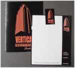
The following Identities I am working on are not a part of a Template but rather the working relationship between a client and a designer. These are works that are in progress, but its identity work that fits with the industry and the clients companies working in that industry.
If you need an identity you should be working with a designer, and stay away from Templates, unless you are a Template

