
Working with Dorel had me in some rewarding situations, producing this edit with a great crew at SUGOI Performance Apparel, Cannondale bikes and the uber talented Matt Dennison was with out doubt one of those times. Lots of work but this edit was a hit with the sales team / blurring the lines between dealer and consumer facing assets – you know what I am talking about.
Tag: Design
Design – The Movie Font
Design – Some Say America is F*cked – Graphically
Don’t drink and shop on Ebay,
Design – Comic Sans
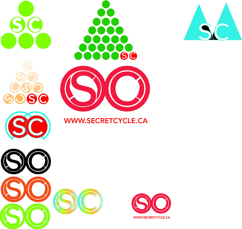
Logo Ideation
It has been awhile since I posted process so here is a selection of some digital ideation. I will spare you the 10 pages of sketchbook work that got me to this point in the creative journey. The client for this logo has been very particular about the numerous levels of meaning within the form and the colour of his logo. We are at the point now where we are starting to refine those elements and get something that we will both be happy with. I should be happy too – right. I am looking forward to getting the form finalized and seeing it in action for the shop.
Stop by Secret Cycles on the West Coast and say hi.

![]()

Corporate Identity
Corporate Identity Glossary |
|||||||||||||||||||||||||||
Logos, corporate identity and branding defined |
|||||||||||||||||||||||||||
|
It’s easy to get lost in designer jargon about corporate identity and branding. Here is a brief glossary to get you up to speed.
|
|||||||||||||||||||||||||||
All above definitions are stolen from Template Central,
The following Identities I am working on are not a part of a Template but rather the working relationship between a client and a designer. These are works that are in progress, but its identity work that fits with the industry and the clients companies working in that industry.
If you need an identity you should be working with a designer, and stay away from Templates, unless you are a Template

A University Graduate
Graduation 2008 was a wonderful affair with superb speeches from our Honorary Doctoral Recipients, and a particularly poignant speech from Bob Rennie. All the students and parents present were proud of our new status, not the least because recent press coverage has confirmed how necessary the new mandate will be to our identity and to what we do. Much of the coverage has focused on us as if we were never a degree granting institution. The coverage has revealed the extent to which the public and the press have not adjusted to the fact that we have been a post-secondary institution for over 80 years. None of the institutions who received university status over the past two weeks even existed when we started with four-year diplomas in 1925. In the 1960’s numerous requests were made to government to recognize our status and nothing was ever done. So, for us, the change simply means a recognition among the public, government, press and community leaders for what we have always been doing. Watch out for an Op-Ed by yours truly in the coming week in the Vancouver Sun. (Ron Burnett)
This was written on the Eciad Site
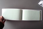
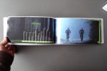
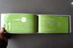
What does it all mean to me, I will be posting more about the exhibit soon, but all I have at this point is a few images of my Green Book, a book of inspiring stories about people who ride their bikes, and for now that is what I am going to do, ride my bike and create a story or 2.
Have a great weekend
Cheers


University?
Emily Carr University of Art and Design has a really big show on for the next week and you are invited. I will be hanging out with my newly polished Green Book, and and looking forward to seeing all the other great art and design pieces – Oh ya; and having a drink or 2, the bar is open Saturday night which is the opening night and Cam Dales will be spinning the tunes.

The link here is for the online Grad Show, my project is completely different from what you will see here, it has come a long way and is at the point where I am feeling pretty good about the entire project. Visit the Grad site for 2008
Stay tuned for new images of the Green Book or come by ECI this weekend.
A DESigner Now
I’m going to be able to milk the “student designer” for about another 3 weeks and at the time I am going to have to start introducing myself as a “designer”.—Exciting.
I have been logged into the design chat at the GDC for about 5 months now and the information has been invaluable in many ways. Making the design world something to be proud of is an organization all creative thinkers should acknowledge.
I have yet to meet Rick Strong, but I am sure our paths will cross, he wrote these inspiring words on the blog moments ago and I was sure I wanted to share them with the 5 people that visit my blog. This was his response to a conversation a few designers were having in regards to dealing with vendors, and clients. It is about reducing designs association with being simply a commodity and taking it to a level that is that of a professional practice.
Pass on the brilliance.
This comment by David is critical to the financial success of Graphic
Designers (caps intentional):
“This method also takes design out of the manufacturing process and
reduces the perception that design is a commodity.”
What Graphic Designers are selling (after we get past the layout stage
of our careers) is essentially “intellectual property” not skills.
Any person who has a copy of Illustrator, Photoshop or InDesign can
draw a perfect circle, clone a background or lay out a newsletter.
People selling those “skills” are now, literally, a dime a dozen.
What IS in short supply are people who, given a specific communication
goal, can take a blank screen or 64 sheets of blank paper and
conceptualize an entire web site or publication that achieves the goal
of the client. This is very much harder than it sounds.
“Doing” a logo or “doing” a layout doesn’t make one a Graphic Designer
any more than taking snap shots with a pricey DSLR makes one a
Photographer. It’s not what’s in our HANDS that counts, it’s what’s in
our BRAIN.
To paraphrase David, “This awareness takes design out of the
manufacturing process and reduces the perception that design is a
commodity.”
Rick Strong,
Ottawa.
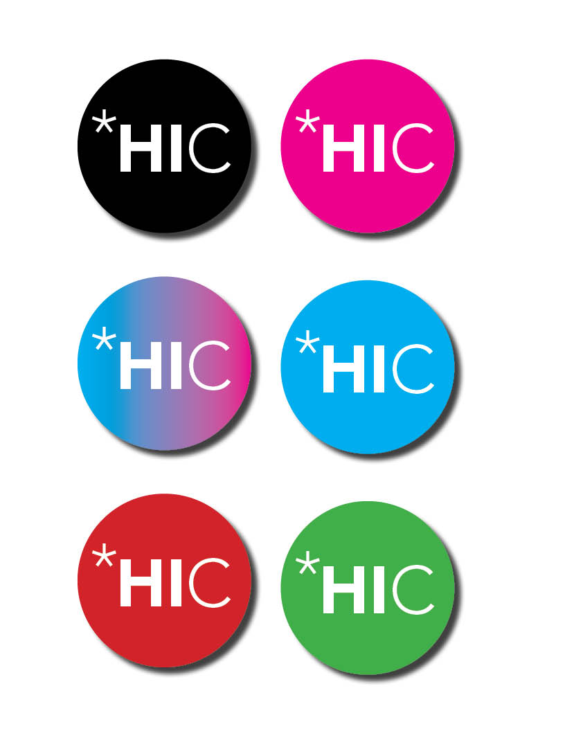
My proprietorship will run under the handle Hoffmanian Creative, and I have been playing a bit with my identity although the level of effort in that department has taken a back seat to stuff going in the grad show at ECI so until next time I will be a *HIC.
Studio J.I.M. _ Collaborative Space
This is the view from my new creative home. Jim, Mark and I are sharing a space in the heart of Vancouver’s China Town and we are loving it, the location is alive and the space we are in is turning into a great little spot for design and illustration. I didn’t include any interior shots as it is looking very creative – if you know what I mean.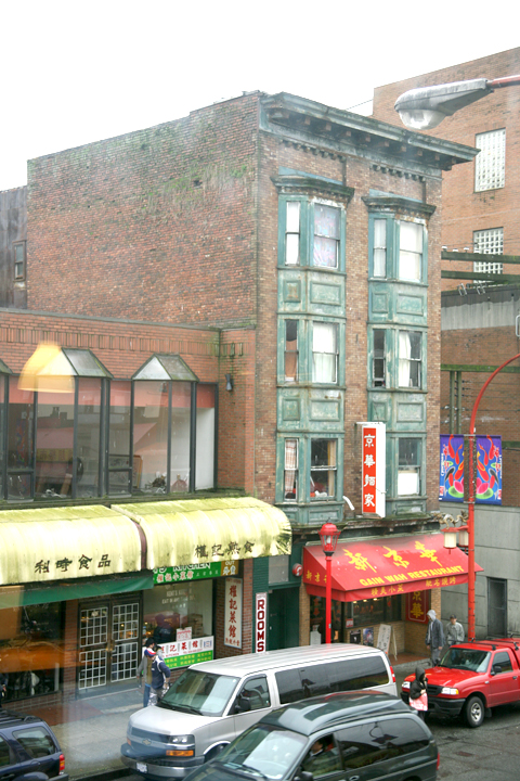
