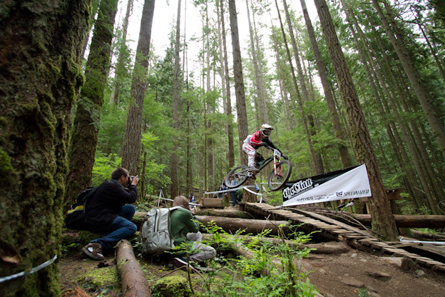
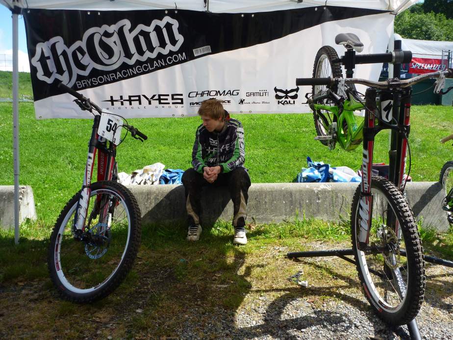
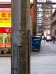
Continuing to combine my interests in design and bikes has allowed me to really embrace my work with Jeff Bryson and his Racing Clan – Here is a banner show-casing the Neds Ga___p Jump. More decals are coming soon for the team and the Clan will be Nation wide. I will also have a post soon about “Tuned by Buckwheat” identity project – stay tuned.
Category: Designer / Art Director
Not Illustration
GRAPHEX 2010 Award WINNER
I need to Thank Matt and all the people who made Graphex 2010 possible – here are Matts Kind words about the MEC Urban Line.
Co-Principal Emdoubleyu Design, Vancouver, BC // emdoubleyu.com
This was a tough decision, but I gravitated towards
this project for a number of reasons.
One, I’m a cyclist.
Two, I’ve done bike design and bike graphics and
I think the designers on this project came up with
a branding solution for these new bikes for MEC in
a really unique, innovative but totally appropriate
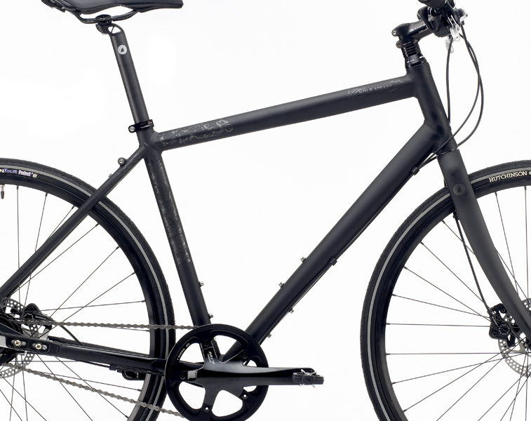
manner. They are urban bikes, they are supposed
to be stealth—you don’t want loud splashy graphics—
and I like the fact that these guys don’t have
to compete against other bikes in the store so they
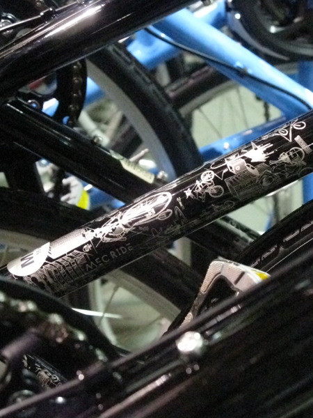
were able to go quite understated in the design. With this design you would have
no problem worrying about locking these bikes on the street because they don’t
look that fancy from the distance, but when you have a chance to get closer and
see the graphics details come together, it is like a very intricate and subtle tattoo
that not many people get to see up close, and you keep discovering new things
on it every time.
And three, they are lots of fun…I’m jealous!
I can not say enough how great it was to work with Terry, Tim, and Judy at MEC on this project and of course credit is do for all the Creative minds at Fleming – who entered this at GRAPHEX 2010 – Design Currency in Vancouver. All the Awards can be seen here – http://graphex.gdc.net/winners/winners.html
Credit Where Credit is Do – Design
More Illustration – Bike Stuff of Course
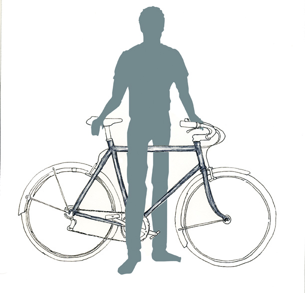
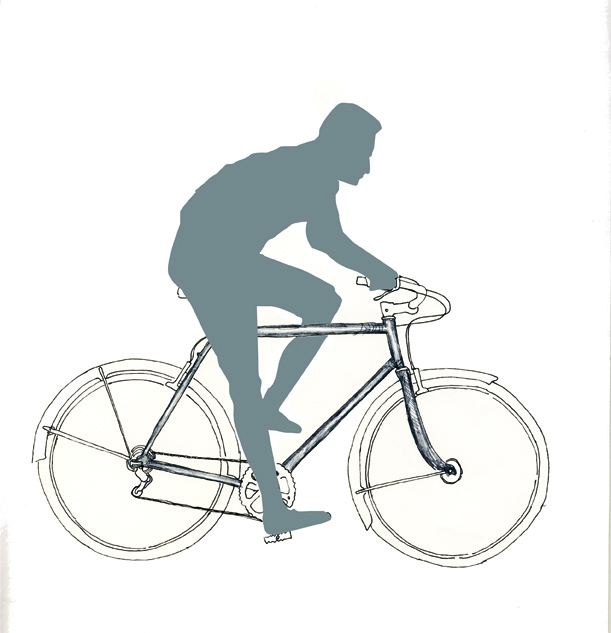
These are a few illustrations for a client who is putting together a training manual. These are some of the first drafts. They are fun little pieces to work on because of the technical demand – I am of course not refering to the challenges of the pencil and pen but more so the challange of accuracy in the images
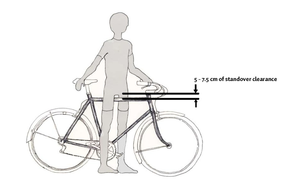

So after a few meeting and a few more people seeing the illustrations there was of course a few changes. The newer ones you see here are interesting in that I used the vector non humanist approach for the human elements and a humanist, traditional illustration approach for the mechanical elements – I am satisfied with the out come. These will be public facing info pieces in a store near you – soon.
Half a lifetime ago – 40 years
Life magazine has had its up and downs, and few near death experiences, and for the most part a life that perhaps by some sort of poetic justice resembles that of a real life. I am not saying that Life Magazine is forty – we know its older than that – but somebody – picture here completely out of context The Father of Funny man Russell Peters shaking his finger disgustedly in his general adolescent direction – Sommmmme-b-o-d-y – turns forty this June – Life half over or half begun – Full? – depends on how you look at it. Can life be half full – What is that supposed to mean.
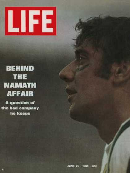
This Life logo here is a bit fatter, than the logo we see today – perhaps a little less health conscious than today’s life. Kerned a bit tighter than today’s spacious version. And the red, well the red – tape perhaps – is closer to “Life” than it once was – I am perhaps grasping if I am going to draw a parallel there but I am sure there are many.
You can see Life on line now sporting what has always made it great and that is the pictures – I after all am a visual kind of guy.
Salute to the Gemini’s – Salute to Life
New Camera
Design – The Movie Font
Design – Some Say America is F*cked – Graphically
Don’t drink and shop on Ebay,
