More Illustration – Bike Stuff of Course
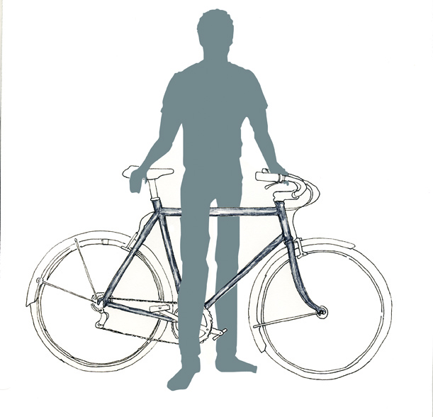
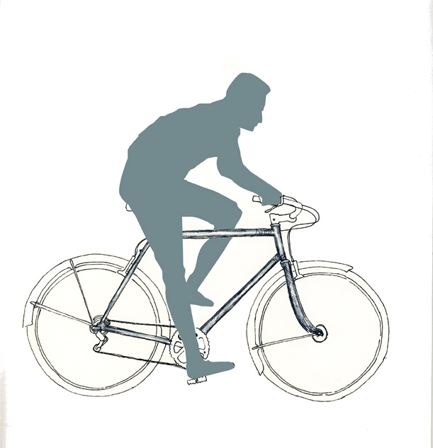
These are a few illustrations for a client who is putting together a training manual. These are some of the first drafts. They are fun little pieces to work on because of the technical demand – I am of course not refering to the challenges of the pencil and pen but more so the challange of accuracy in the images
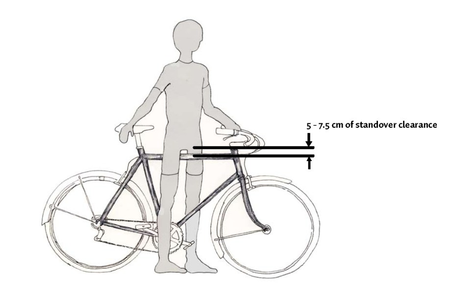

So after a few meeting and a few more people seeing the illustrations there was of course a few changes. The newer ones you see here are interesting in that I used the vector non humanist approach for the human elements and a humanist, traditional illustration approach for the mechanical elements – I am satisfied with the out come. These will be public facing info pieces in a store near you – soon.
Flow – A show illustrating the Shores Bike Culture.
At the Presentation House Gallery until August 2.
OK so the interesting thing is it’s about bikes on the Shore, the birthplace of Freeride, skinnies, ladderbridges, and all that great stuff. More impressive is it’s about the Photography of Sterling Lorence , and to top it off – there are ridable ramps, tire marks on the walls and heavy beats filling the rest of the space. There was even some of the original Cedar refuse from a decommissioned trail on Cypress build by Dangerous Dan and removed by the city of West Vancouver a long long time ago. It definitely added a sense of depth to the Photography on the walls.

What I would have like to see more of, would have been more photography, Sterling has a massive library to choose from and I was a bit disappointed at the limited amount that was shown. Sterling was ever so generous when I was at Emily Carr and allowed me to use some of his incredible images in my grad project. The Green Book.
I also attended the panel discussion and I was left wanting more there aswell. I think Cam from NSMB did a great job and I was wishing he had more time – I am sure he had more. The topic for the panel was the Sustainability of the trail system on the North Shore. A great topic that was lost in some panel members waiting to hear more specific questions and playing it politically safe while others rambled on with a lack of direction – Cam could have reeled them in. I guess in terms of a panel talk I would give it 5 out of 10 and the show 7 out 10.
If you have 15 minutes in the next week – see it before it closes, If you are not familiar with Sterling’s ability to capture light where many fail to find any – light that is – you will be impressed. If you are into Mountain biking be sure to plan it around your next ride.
Its only up until August 2
Back to the Drawing Board
Jimmy and I met up at the Studio ( Happy Surly Unlucky ) for a little Drink and Draw. At my age I need all the help I can get.
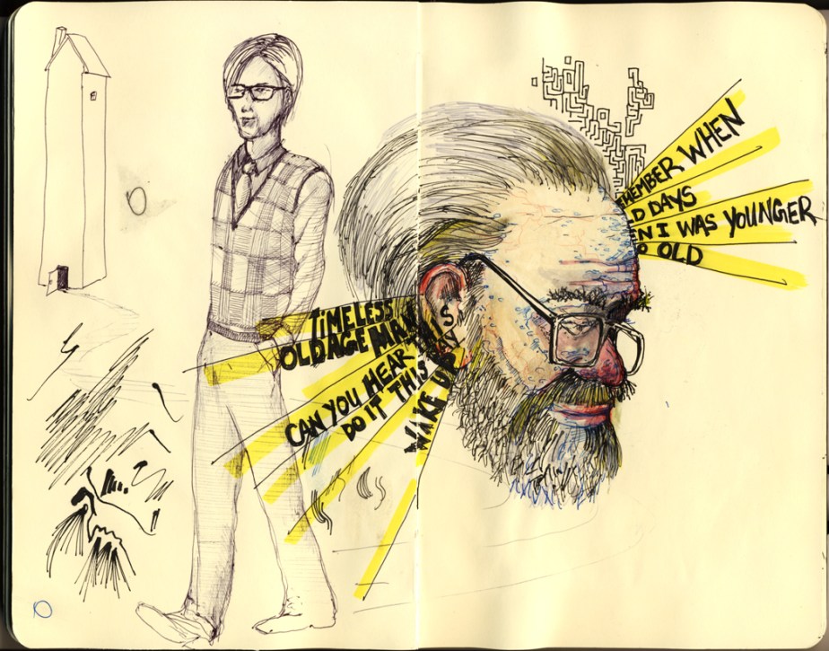
I was great to get the old analog tools out again, for funzzies of course. Just in case you were wondering I don’t really feel this old – close but not really.

Half a lifetime ago – 40 years
Life magazine has had its up and downs, and few near death experiences, and for the most part a life that perhaps by some sort of poetic justice resembles that of a real life. I am not saying that Life Magazine is forty – we know its older than that – but somebody – picture here completely out of context The Father of Funny man Russell Peters shaking his finger disgustedly in his general adolescent direction – Sommmmme-b-o-d-y – turns forty this June – Life half over or half begun – Full? – depends on how you look at it. Can life be half full – What is that supposed to mean.
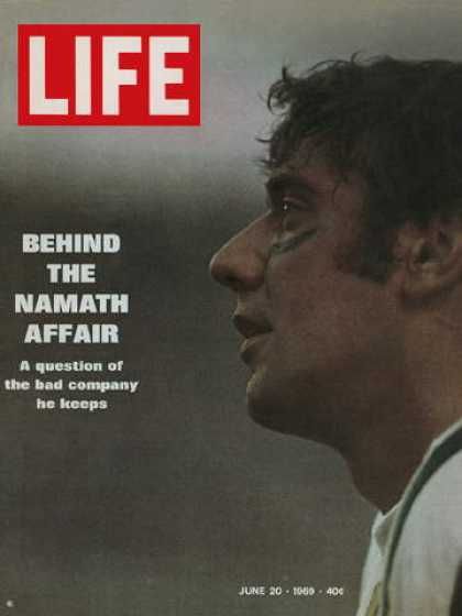
This Life logo here is a bit fatter, than the logo we see today – perhaps a little less health conscious than today’s life. Kerned a bit tighter than today’s spacious version. And the red, well the red – tape perhaps – is closer to “Life” than it once was – I am perhaps grasping if I am going to draw a parallel there but I am sure there are many.
You can see Life on line now sporting what has always made it great and that is the pictures – I after all am a visual kind of guy.
Salute to the Gemini’s – Salute to Life
Lance, Shepard, and Kenny
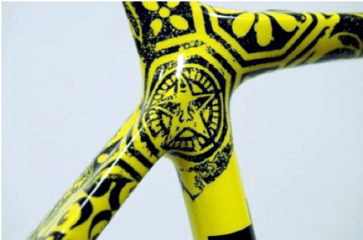
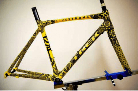
Shepard Fairey and Kenny Scharf have teamed up with TREK for a series of supertouch curated art bikes that made an appearance in the Tour OF Italy. Lance Armstrong in his first ever appearance at the Giro d’Italia will be showing off his skill after retirement and at the same time letting the world see a little bit of his great taste in art. The bikes are also part of Fairey and Scharfs efforts to bring attention to Lance’s upcoming STAGES art show benefiting Armstrongs anti-cancer charity Livestrong.

While fairey’s cycle (above) is inspired by Lance’s charity work and includes delicate patterns taken from Italy’s architectural and artistic heritage, Scharf’s work is more utilitarian, creating a “lightspeed” space- inspired aerodynamic bike. For those of you who might want to get your hands on a little piece of touring history, the bikes will be auctioned off on October 2nd during the NYC leg of the STAGES tour and proceeds will go towards Livestrong.
Vancouver Screening – Objectified
I was at the screening of Objectified the other day and I would have to say that I found Helvetica to be more interesting but that may just be that my interests are a bit more weighted in the graphic direction. What was interesting though was that Gary Hustwit was there to answer questions after the film and that in itself was almost as entertaining – One young guy asked him “in the Light of Avitars – if Gary was a fish want kind of fish would he be?” Gary responded with “that is the dumbest F–king question I ever heard – Can I quickly get another question” the audience responded with a uneasy laughter – Rude – Maybe ?
All in all it was a great evening, he has a third film of a similar flavour on the back burner – our guess over apres mexican food was that it would be about Architecture but Gary would not answer that question either. He also said he wanted to do a film about Tom Waits – I hope he crosses paths with Jim Glens Grad Project from ECUAD 2008 – Whats he Building in There
If you are interested in design and especially design of products that you perhaps might not even see as being designed at all – Objectified is worth a look.
Henderson Mats – Design and Illustration
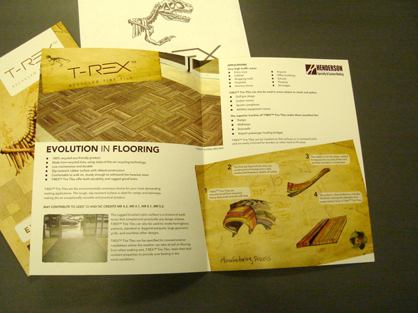
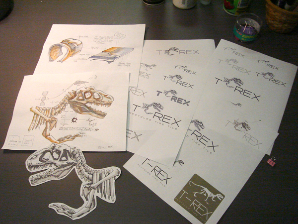
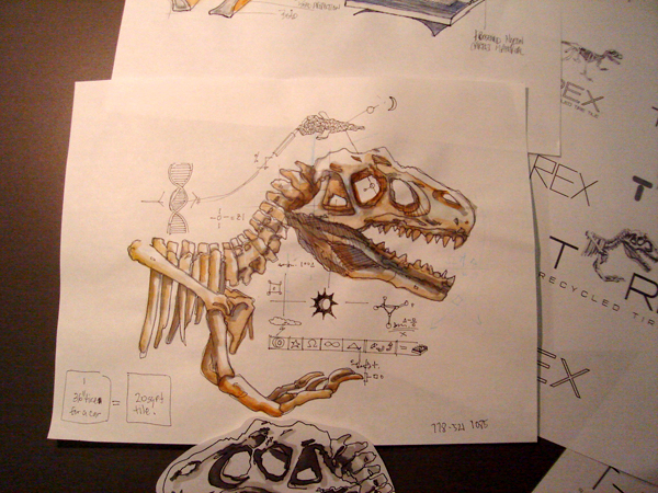
When a project comes along that requires design and illustration it is a good day. Working with the people at Henderson Mats in the lower mainland has been a great experience. I was able to provide them with a unique piece for a unique product. I am posting some of the process snap shots here, and my website should soon have some more polished shots of the various elements including the logo, a brochure and a couple illustrations.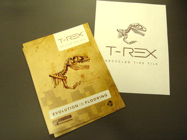

James Jean and Lance Armstrong
So if you are a fan of art, and especially James Jean coupled with a passion for cycling and namedly guys like Lance then perhaps you have seen this on Supertouch.
If not:
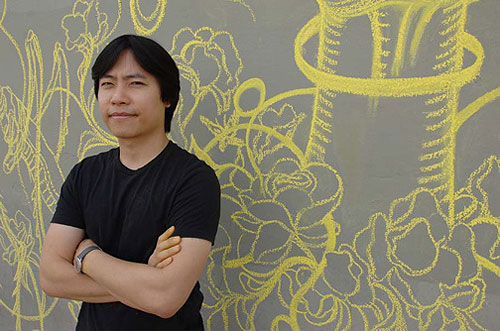
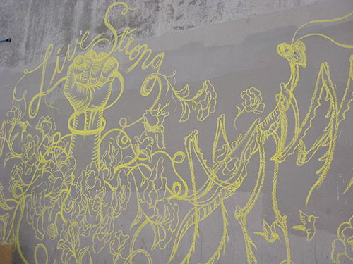
In an effort to raise awareness for his LIVESTRONG foundation’s endless fight against the cancer burden worldwide, Supertouch buddy LANCE ARMSTRONG has commissioned a series of “Open Roads” street level chalk art installations that began in LA this weekend with the work of nascent art star JAMES JEAN. Attacking the Venice boardwalk on Saturday, Jean quickly grabbed public attention with his incredible yellow chalk mural that in turn inspired over 600 passers-by to pick up chalk themselves and break loose with their own impromptu yellow “street art.” Keep your ears peeled for some huge Lance art news coming later this week on ST. Meanwhile, HAVE A LOOK:
Marry Me
Directed by Michelle Lehman, last year’s Tropfest Australia winning film, Marry Me, tells a little love story about a little girl who likes a little boy and a little boy who likes his BMX bike. The film was inspired by a true story when director, Michelle, at 5 years of age, would chase Jason Mahooney around the school in a pretend wedding dress (her mother’s nightie).


